|
|
Post by Daft Punksworth on Jan 28, 2010 20:19:01 GMT -5
EPIIIIC. I love how it matches the forum skin. XD
I caught a glimpse of it and ended up refreshing the home page 15 times to see it again. x3 Tis awesome!
|
|
|
|
Post by Blaze on Jan 28, 2010 20:58:20 GMT -5
EPIIIIC. I love how it matches the forum skin. XD I caught a glimpse of it and ended up refreshing the home page 15 times to see it again. x3 Tis awesome! LOL Yes I wanted to try and incorporate the colors a bit more than just the Command Wolf itself and a dusk setting gives the perfect opportunity! @vargen: I LOVE dusk settings just for that atmospheric feel. Tis why I just kept listening to that song over and over since it matches the atmosphere so perfectly <3 |
|
|
|
Post by Blaze on Jan 29, 2010 16:41:46 GMT -5
Drew Hayate Liger while watching eps of Zoids NC and Transformers last night to keep myself awake because I had to look after my mom (She slipped and fell on ice last night leaving my sis's basketball game and broke her wrist so I stayed up til 5 in the morning taking the ice on and off). So I decided to draw entirely on the computer, just because I want to play with my new Wacom. At least the cool thing about drawing on the computer is that I can save all my steps :3 The basis that lets me get the pose right. This is actually where my "chu" zoids' heads are from XD 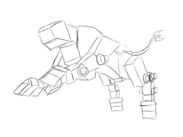 After that I just keep piling on shapes until the form is created. 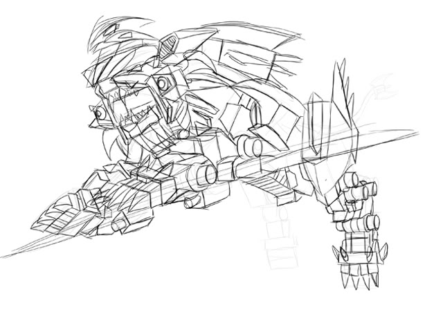 Finally I go back in on a new layer and use the pen tool to make the nice neat line work. 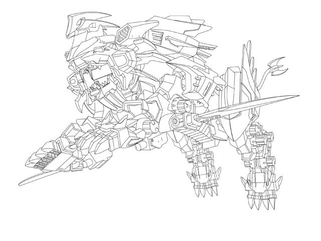 Now on to background and color! *FLAIL* |
|
|
|
Post by La Volpe on Jan 29, 2010 22:33:06 GMT -5
Holy... shit.... that is awesome. If only I can do Zoids with as much uber awesomeness as you do XD
|
|
|
|
Post by Blaze on Jan 30, 2010 1:13:30 GMT -5
lol I just had a lot of practice XD
|
|
|
|
Post by GhostLiger on Jan 30, 2010 13:30:41 GMT -5
Dang, if you're doing all that with the pen tool, no wonder it takes you so long ^^;
|
|
|
|
Post by Blaze on Jan 30, 2010 17:03:18 GMT -5
Yes the lack of a scanner sucks XD Base colors!!!! I like my Hayate's colors better than the original's ^^; 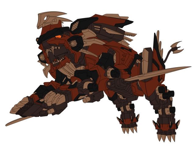 |
|
|
|
Post by Daft Punksworth on Jan 30, 2010 18:10:40 GMT -5
Looking good! :3 And I do love your colours. X3
|
|
|
|
Post by GhostLiger on Jan 31, 2010 10:06:56 GMT -5
Stunning!!
Did you use the pen pressure option when laying the stroke for the outline, or is it one solid line?
|
|
|
|
Post by Blaze on Jan 31, 2010 12:03:08 GMT -5
Just a solid line stroke :3
|
|
|
|
Post by Comrade Vargen666 on Jan 31, 2010 12:38:12 GMT -5
I like it. Blocking in the colours really brings order to the chaos of lines.
|
|
|
|
Post by Blaze on Jan 31, 2010 14:22:16 GMT -5
lol yes. I had to keep looking at pics of Hayate sometimes to see what was suppose to be what color. Now that that's all sorted out, the shading is the easy part.
|
|
|
|
Post by Blaze on Feb 3, 2010 13:57:09 GMT -5
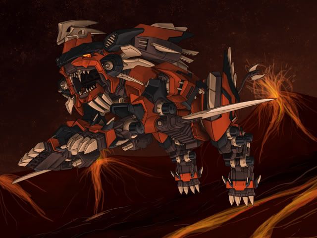 YAY DONE WITH BASIC SHADING! Yes, basic. And a really fast crappy rendition of how I want the background to look. ONWARD TO FIXING UP SHADING AND BACKGROUND! 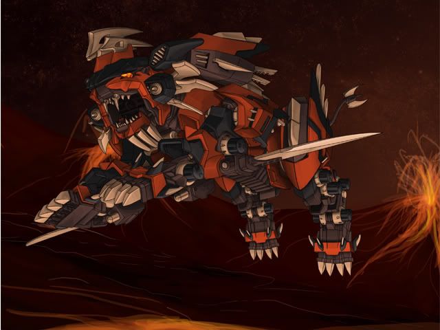 Flipped the background to go the other way. I think it better this way. Yes no? |
|
|
|
Post by Wolftiger on Feb 3, 2010 14:51:25 GMT -5
Definitely the second one, it is better. I like it better because the lava is running under Hayate providing the reason for Hayate leaping and the lighting on the belly.
Base on your "basic" shading the light source seems coming from front right and below, (I apologize if I am wrong). With the first pic there a big volcano right behind Hayate on left, it kinds of argue with the lighting on Hayate.
I like the pics a lot,can't wait finished piece!
|
|
|
|
Post by Blaze on Feb 3, 2010 15:47:22 GMT -5
Yeah the whole shading idea was for the light source coming from the lava under him ;D
|
|