|
|
Post by Daft Punksworth on Jan 20, 2010 15:54:06 GMT -5
Does that produce a different result, I wonder? Or is it just two techniques to get to the same point?
|
|
|
|
Post by Blaze on Jan 20, 2010 16:02:22 GMT -5
Does the same thing, just different way of doing it. It just takes longer doing it your way. It's actually how I first made curves too XD
|
|
|
|
Post by GhostLiger on Jan 23, 2010 16:02:33 GMT -5
If it helps, here's the tutoral that taught me how to use the pen tool for my linearts acaraluv.deviantart.com/art/lineart-with-the-pen-tool-21814747But instead of just doing lines, you need to make shapes with it for SB's tut, and click fill path instead of stroke path... if that makes any sense... It seems hard at first, but once you get used to it, it becomes second nature. |
|
|
|
Post by La Volpe on Jan 23, 2010 22:45:52 GMT -5
If it helps, here's the tutoral that taught me how to use the pen tool for my linearts acaraluv.deviantart.com/art/lineart-with-the-pen-tool-21814747But instead of just doing lines, you need to make shapes with it for SB's tut, and click fill path instead of stroke path... if that makes any sense... It seems hard at first, but once you get used to it, it becomes second nature. Ooh~ *favs the tut to test it out later* |
|
|
|
Post by Blaze on May 14, 2010 1:00:47 GMT -5
Alrighty! So in this tutorial, I'll show and explain how I do my blendy/sketchy style like how I did Rumble and Frenzy and Murasame. 1st step is to obviously organize your work space, get you photo refs to sample colors from, and organize layers. I'm using Photoshop CS4.  Create a layer under your lineart. If you scanned in your drawing and need to create your lineart from it, follow Ghostie's Cleaning scanned lineart tutorial. Now on that new layer (or several layers. however you work) you're going to paint the base colors. It's easy when you have ref pics, because you can just use the eyedropper tool and sample the color right from the ref.  As you probably remember, I had a grayscale shading layer. So here's a comparison of the layer turned on and off. It pretty much shades for you and takes away the amount of shading you'll have to do. 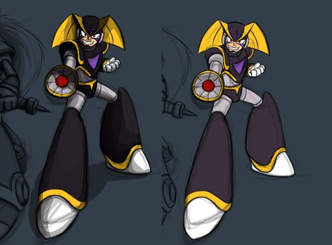 Now from here you can work different ways. You can lock the transparency on the base color layer and shade right on that layer, or just create a new layer and shade on that. The transparency lock does exactly what it says it does. That way you don't have to worry about going outside what you colored. I work both ways.  I'm starting with the highlights since the grayscale shading gave me my darks. So I pick a really pale yellow for the yellow highlights.  Now with the brush tool selected, set the opacity level to 10%. Now when you go over the base color, it slowly builds that pale yellow up. You can play around with the different opacity %s. You can also control the % amount with the number keys on the keyboard. 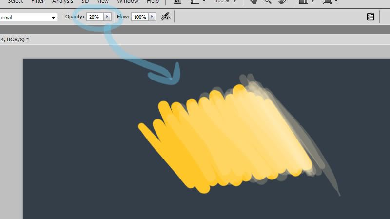 And that's pretty much it. You just keep shading like that, and use the eyedropper tool to select colors and brush them on with the low opacity to blend.  Finished highlights and darks: 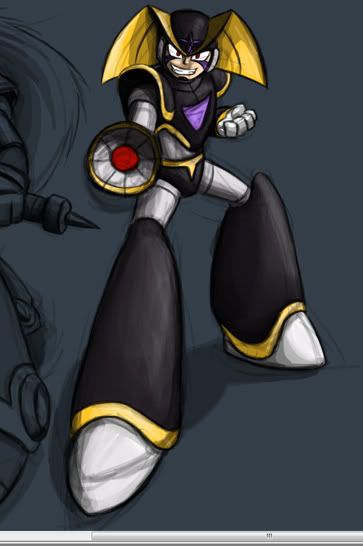 Then to create the awesome color glow, just make a new layer and select the color you want as a glow and apply it with a 10-20% opacity brush. Purple back lighting glow: 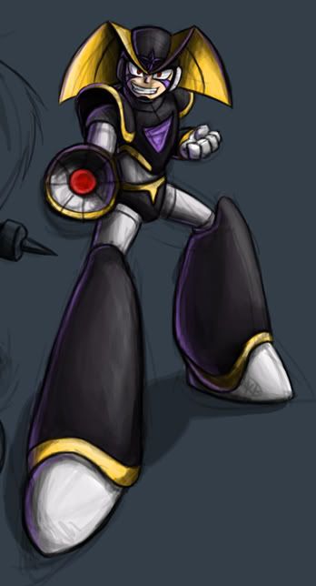 Finished piece: 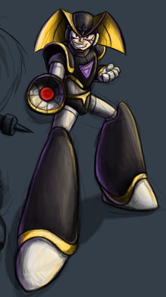 Close up so you can see my brush strokes... psycho Bass FTW!  The fun part about coloring like this is that there are many different styles you can get from it. You can be messy like this, or smooth and very blendy. This is how you do the blendy style. You keep selecting colors with the eyedropper tool and apply them with a really low opacity until they seem to blend together :3 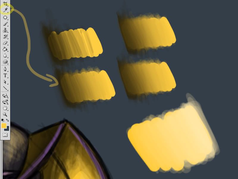 This is a WIP I've been working on of Armada Sarscream that uses this same technique, but I blend the colors really well so it doesn't really show the brush strokes. Gives a nice soft look. 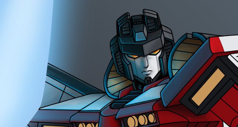  |
|
|
|
Post by GhostLiger on May 14, 2010 15:27:54 GMT -5
Hmm, similar to the way I coloured the Evil Pegasus, cept without the greyscale shading and a lot more messy
|
|
|
|
Post by Blaze on May 14, 2010 15:52:23 GMT -5
Oh yeah! I remember that. Yeah, same idea. Practice makes perfect Ghostie :3
I always like to have that greyscale shading just because it's less work you'll have to do later XD
|
|
|
|
Post by Daft Punksworth on May 15, 2010 6:49:11 GMT -5
I do something similar, but a little different... I do use the opacity brush, do your "sloppy" like style, then use the blur tool to make it neater. XD
|
|
|
|
Post by Blaze on May 15, 2010 13:40:57 GMT -5
I do something similar, but a little different... I do use the opacity brush, do your "sloppy" like style, then use the blur tool to make it neater. XD Pppfff, cheater XD |
|
|
|
Post by Daft Punksworth on May 15, 2010 19:26:32 GMT -5
Yea. XD I r teh lazee.
|
|
|
|
Post by Blaze on Oct 24, 2010 19:01:34 GMT -5
Going to show you guys a new way to color and also how to get new effects using simple layer masks and textures ;D The first step is to draw and shade your pic all in black in white. I have a slight amount of blue tint in mine. 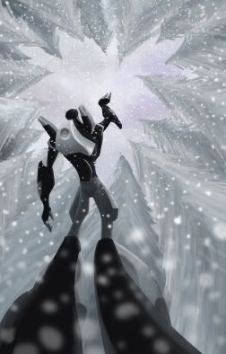 Next is to add the color. All you need to do is create a new layer and change the layer mode to "color". Apply the color at 100% opacity. 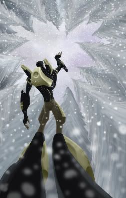  Now to add some atmosphere with some simple layer masks. First you create a new layer and fill it completely with your desired color. Set the layer mode to color once again. Create a layer mask by clicking the layer mask button. Then use the gradient tool to make the mask.  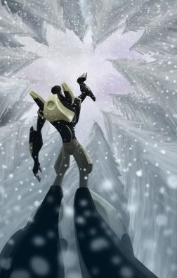 Alright looking good, but the legs stand out too much. So I added another layer mask with a almost white fill. This time I had the layer mode set to normal.  And now the last step is to add a texture overlay to give it that extra kick. Got the texture from the internet. DA also has a lot of great stock textures. Copy it onto the art as the first layer so it's on top of everything. In this case, I had to desaturated it to black and white. Then change the layer mode to "overlay" and play with the opacity or fill (they both do the same thing).  And the final result:  |
|